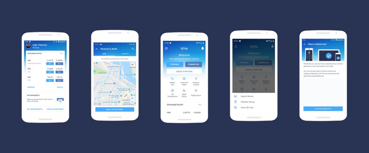
UX Research · Comparative Testing · Mobile Banking
Two concepts, and a test that decided between them
İşbank had two candidate designs for the screens people see before they log in, and a room full of informed opinions about which was better. We measured instead of arguing.
- Year
- 2017
- Role
- UX Researcher, agency team
- Context
- İşbank mobile banking app, pre-login screens
- Team
- Four UX designers and a UI designer at the agency
- Methods
- Comparative usability test scored on SUM, desirability study, ideation workshop
- Scale
- Two concepts, iOS and Android, more than 900 minutes of sessions
- Status
- Shipped
Two concepts and no agreed way to choose between them
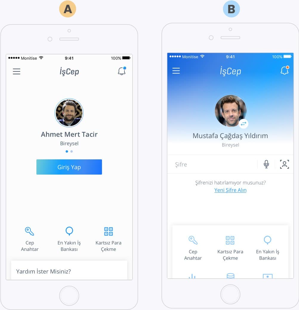
The bank wanted to renew the screens a customer sees before logging in. Research and ideation produced two alternative concepts, and stakeholders reviewed both and commented on colour, layout and which features belonged there. That is the point where a project usually picks the option with the most senior person behind it.
We had four questions instead, and none of them could be answered by discussing the designs: which option performs better and why, what each one trades away, which usability problems each carries, and which of them makes the bank feel trustworthy to people who use it every day.
One number per task, so the two designs could be compared
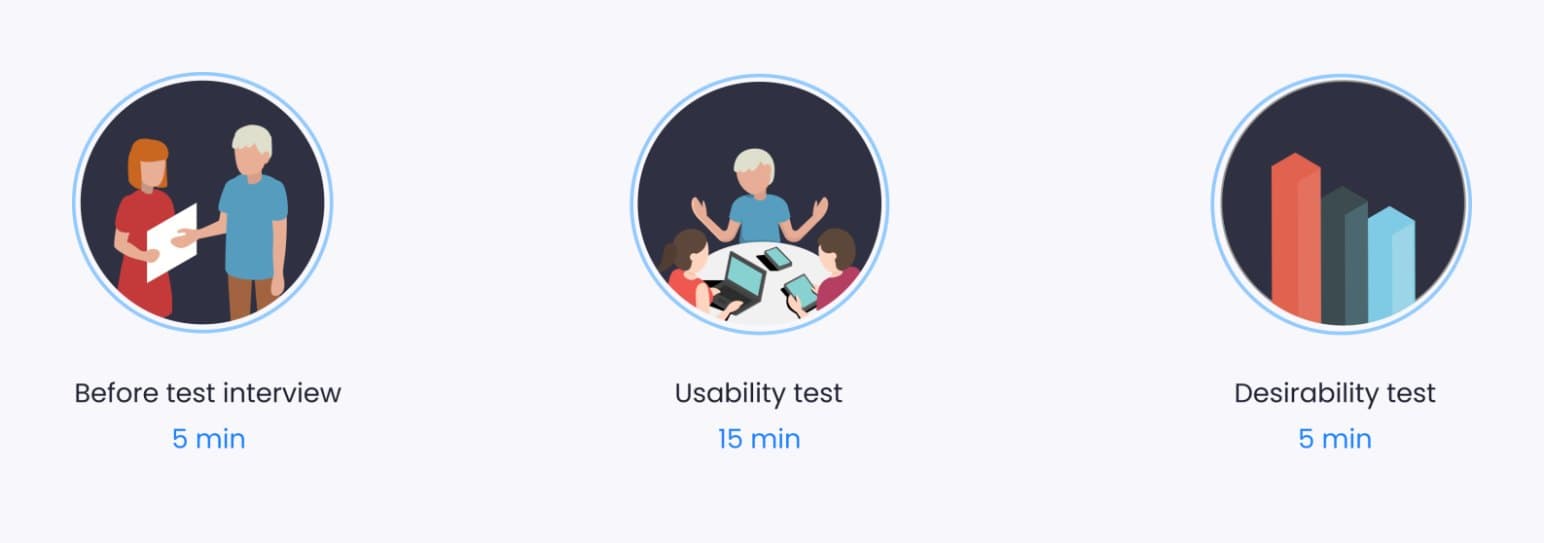
A comparative usability test scored on SUM answered the first three. SUM is Jeff Sauro's Single Usability Metric: it folds task completion, errors, time on task and satisfaction into one score per task, which is what makes two designs comparable rather than merely both tested.
- 1
Both concepts, same tasks
First impressions of the pre-login screen, finding login, switching user account, changing the password, and whether people noticed and understood the new features.
- 2
No think aloud, deliberately
Thinking aloud changes how long a task takes. Since time on task feeds the score, we left it out and gave up the running commentary to keep the timings honest.
- 3
Satisfaction captured per task, not per session
Each participant rated each task as they finished it, so satisfaction could be attributed to a specific step instead of to the whole experience afterwards.
- 4
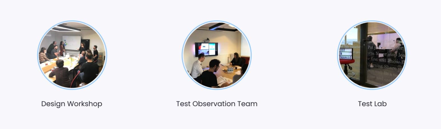
The team watched live, in the next room
Sessions were broadcast to a second room where the team took their own notes. Stakeholders who watch the test argue with the findings less.
Neither concept won outright, which is what made the result useful
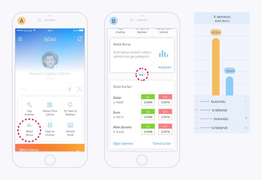
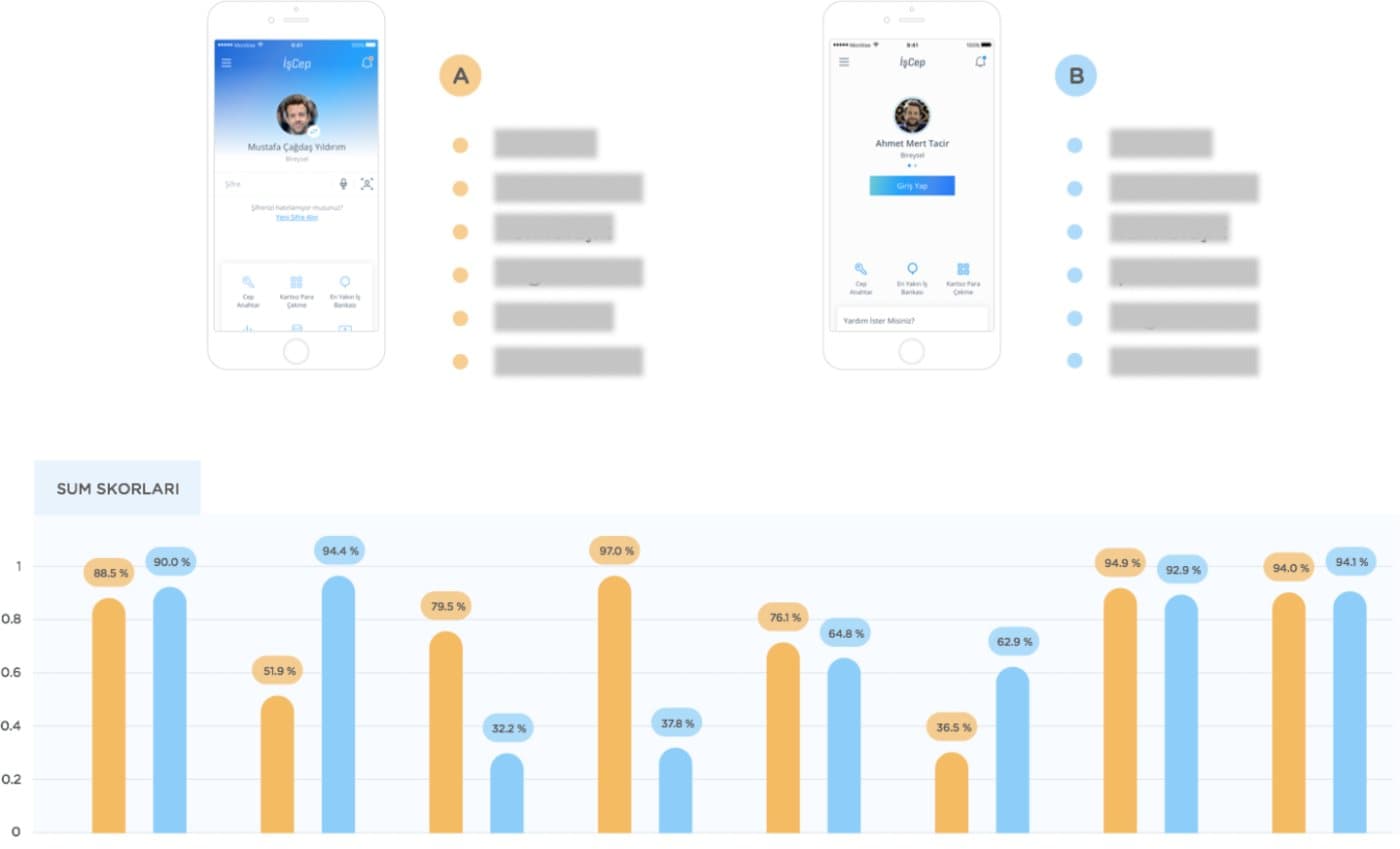
Scored task by task, the two designs traded wins. On some tasks the gap was enormous, 97% against 37.8% on one scenario, and on others the two were within a percentage point of each other. A single verdict would have thrown away most of what the test found.
A usability test cannot tell you whether a bank feels trustworthy
The fourth question was about how the design felt, and a usability test is the wrong instrument for it. The bank still needed the answer, so we ran a desirability study with Microsoft's Product Reaction Cards, the card set Joey Benedek and Trish Miner published in 2002.
Ask after the task, not instead of it
The cards came out after the usability test, so reactions were formed by using the design rather than by looking at it.
Let people choose the words
Participants picked the cards that described the design, from a set including familiar, fresh, impressive and innovative. Which words people reach for is the finding.
Two methods, two kinds of answer
SUM said which design worked better on which task. The cards said which one read as the bank. Neither would have been enough on its own, and the pair is what let the decision be made without a vote.
The workshop is where data became design decisions
Results do not turn into a product on their own. We presented every insight to the team first, then split the room into three groups, each with a brief covering information architecture problems, user paths and micro-interaction ideas.
Five minutes alone with sticky notes before anyone spoke, so the loudest opinion did not set the direction. Twenty minutes of working through the ideas, then voting and sketching the ones that survived.
A team will always hold different views about a design, and that is not a problem to be removed. Putting the research and the test results in front of everyone before the decision is what made agreeing on one easier.
Outcomes
- ✓The pre-login design decided on evidence rather than on seniority, task by task, with the usability problems fixed before it shipped
- ✓Registration and login took less time, and feature usage went up
- ✓More customers set their new PIN quickly, which was the KPI the bank was watching
- ✓Support messages about logging in went down
- ✓A customisable pre-login screen, so people arrange the modules they use before they authenticate