Product Design · Usability · Enterprise SaaS
Simplifying Hybrid Working
Reserve a desk, see who is in, and decide how much office you actually need. Workspace management for teams that stopped coming in five days a week.
- Year
- 2021 to 2022
- Role
- UX/UI Designer
- Context
- LIZ Smart Office, workspace management SaaS
- Surfaces
- Booker mobile app, admin web, Microsoft Teams app
- Methods
- Customer feedback analysis, usability fixes, iterative prototyping
- Status
- Shipped
Companies were paying for floors nobody sat on
LIZ lets people reserve a desk or workspace, see real-time occupancy, and pull reports on how space is used. Companies were paying for floors nobody sat on, and had no evidence either way.
What I worked on
I worked on three parts of the product. I redesigned the workspace manager setup flow and insights page based on customer feedback, fixed usability issues in the Booker mobile app, and designed the Teams web app using the Microsoft component library.
Booker app: simplifying the date picker
The Booker app is where an employee books a desk, and it was where people fell out of the flow. I focused on two components: the date picker and the tab bar.
The date picker was the worst offender. Choosing a date and time took more steps than it needed, so I cut them and made selection direct.
The tab bar was overloaded. I prioritised the core features and reduced the clutter around them.
Admin insights: built from scratch
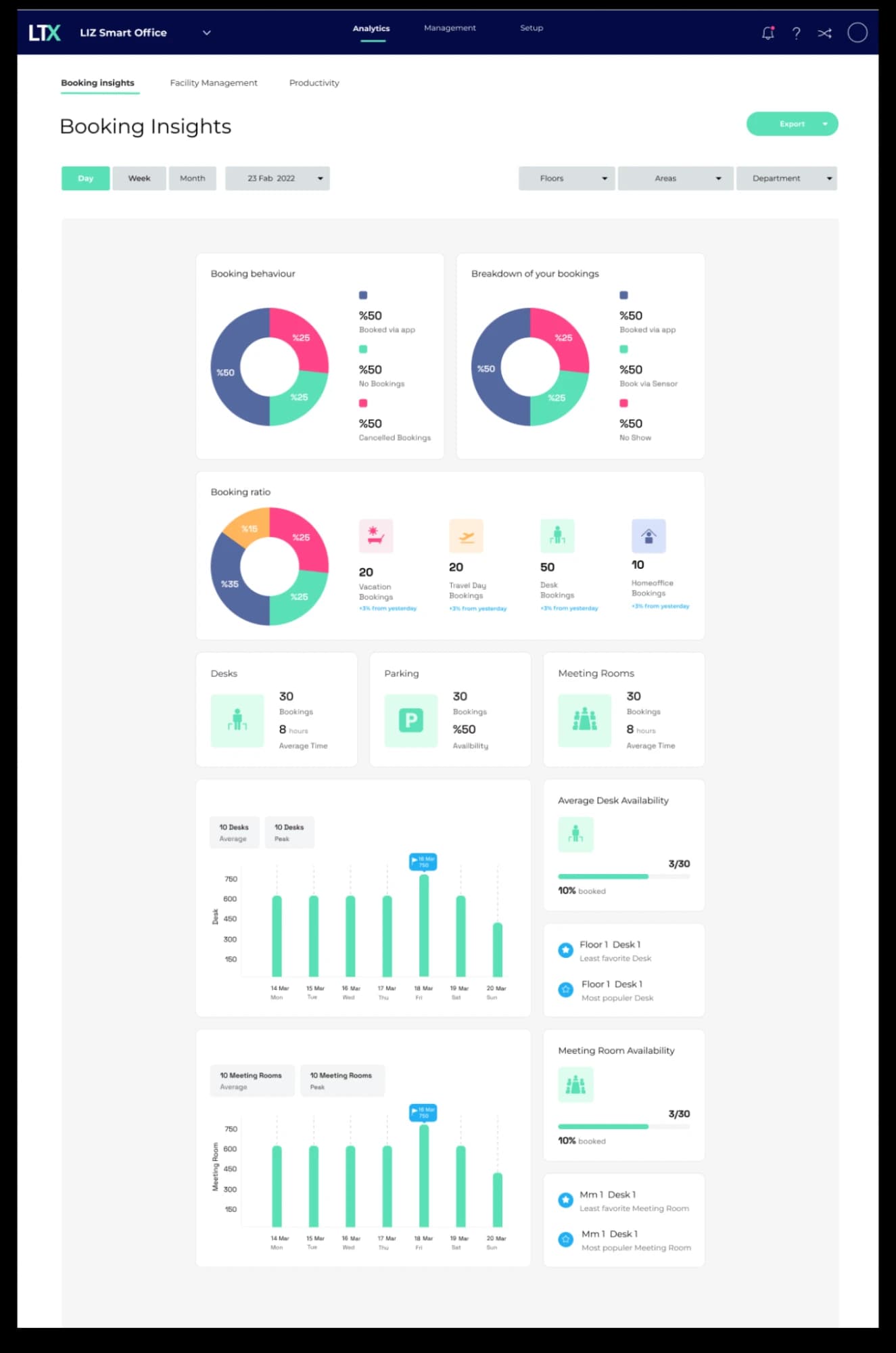
Working with the product manager, I designed an insights page for admins that did not exist before.
Bookings in advance versus real time
Two very different behaviours that were previously invisible. Planning ahead and grabbing a desk on arrival need different amounts of space held back.
No-shows
How many employees reserved a desk and did not turn up. This is the number that changes how much space a company thinks it needs.
Summary first, detail underneath
The most important figures sit at the top, so an admin can see the state of the building at a glance.
Teams app
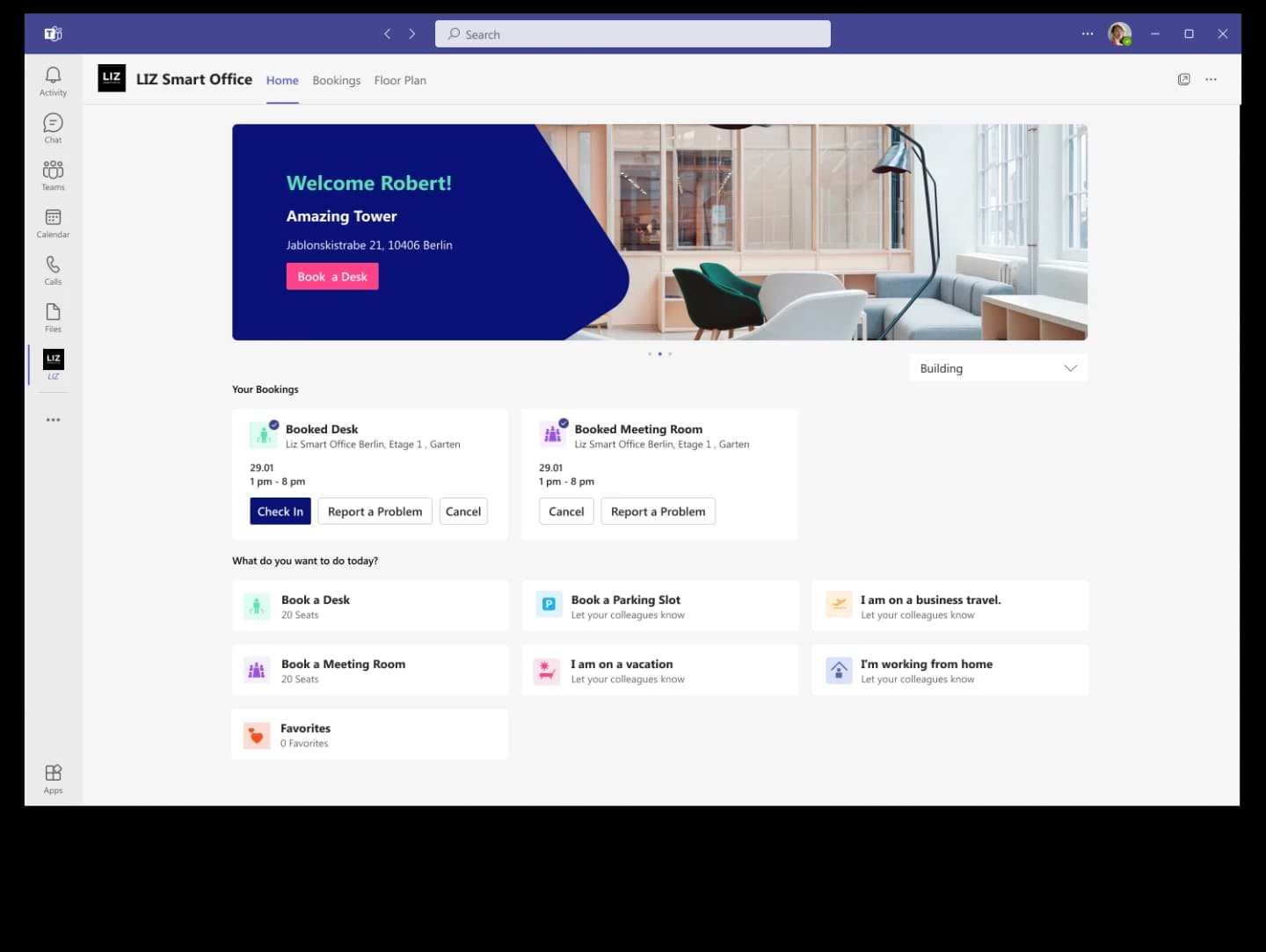
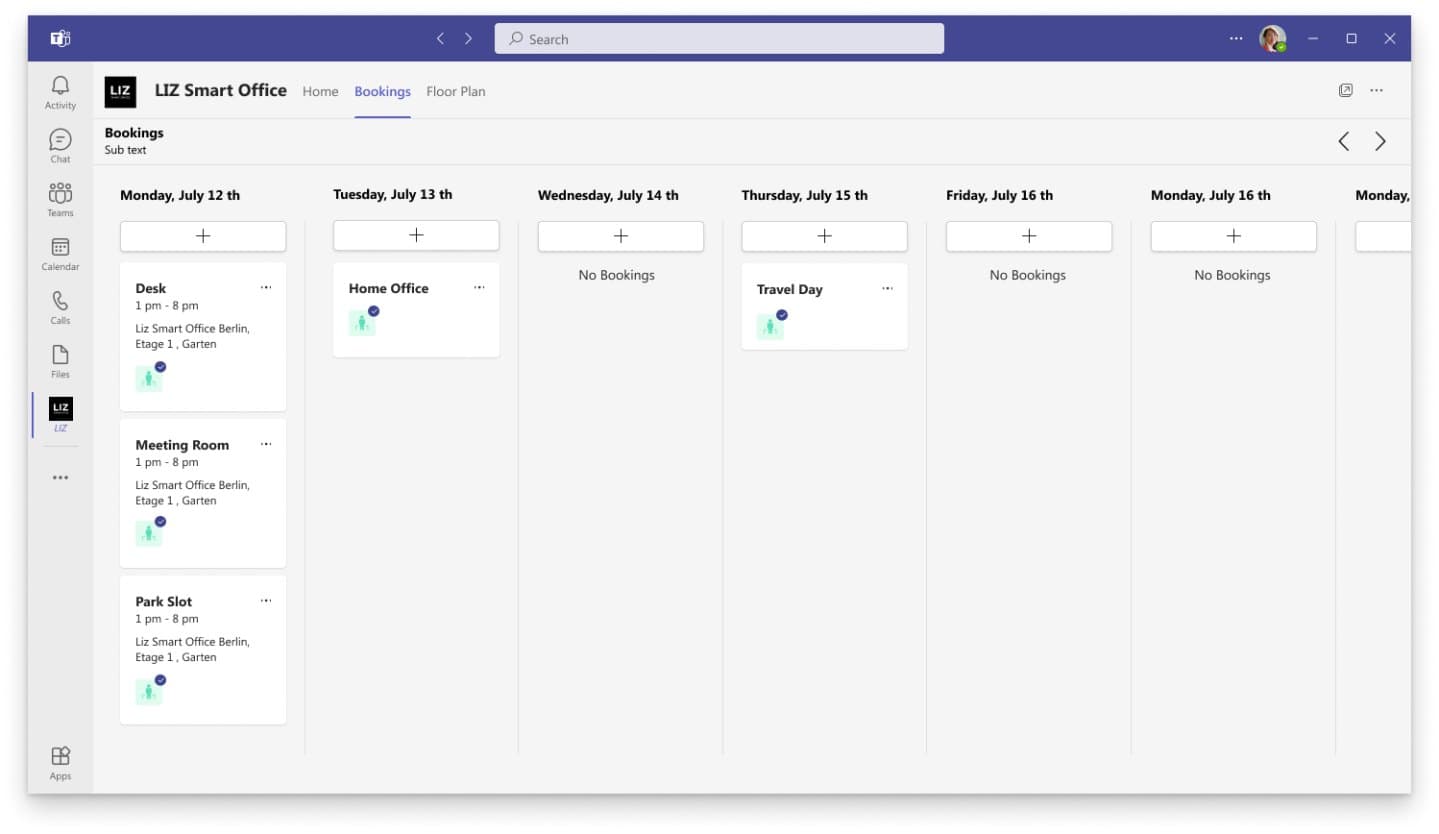
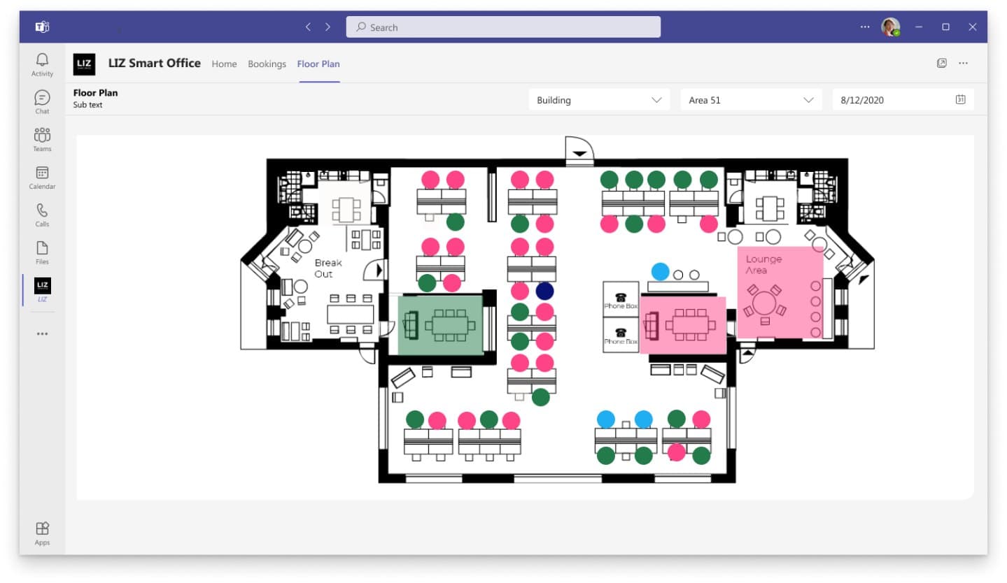
The Teams app had to look and feel like Teams. I designed it with the Microsoft component library so it feels native inside the client.
Outcomes
- ✓Booking flow simplified: fewer steps between opening the app and holding a desk
- ✓Admin insights page shipped from scratch, giving space decisions an evidence base for the first time
- ✓Teams app delivered on the Microsoft component library, native to the client it lives in
- ✓Stakeholder expectations aligned through iterative prototyping sessions