Systems Mapping · Ecosystem Research · Sector Analysis
87 stakeholders, three company types, one map
One product category, three completely different actor landscapes. Mapping who is in the room, what they hold and what breaks between them, so the roadmap could be aimed at people rather than at systems.
- Year
- 2025 to 2026
- Role
- UX Researcher
- Context
- Client, renewable energy SaaS company
- Methods
- Desk research, stakeholder mapping, comparative analysis
- Sources
- Gartner 2025 energy software report, three vendor case study libraries
- Status
- Delivered, phase two in progress
Same category of software, completely different buyers
The client builds monitoring and prediction tools for renewable energy companies. They wanted to know who actually uses these tools, and why that changes so much from company to company.
A large power company with 30 plants across five countries looks nothing like a 14-plant independent producer or a pension fund with a remote portfolio, even though they buy the same category of software.
The approach
- 1
Read the sector
Extracted actor and tool data from Gartner's 2025 industry report on energy management software, and from three vendor case study libraries.
- 2
Classify company types
Gartner defines three buyer types: large power company, independent producer, and investment fund. Each runs differently and involves different people.
- 3
Start from humans
Mapped actors by role first: who is in the room, what they need to see, and what they hand off to whom.
- 4
Make it interactive
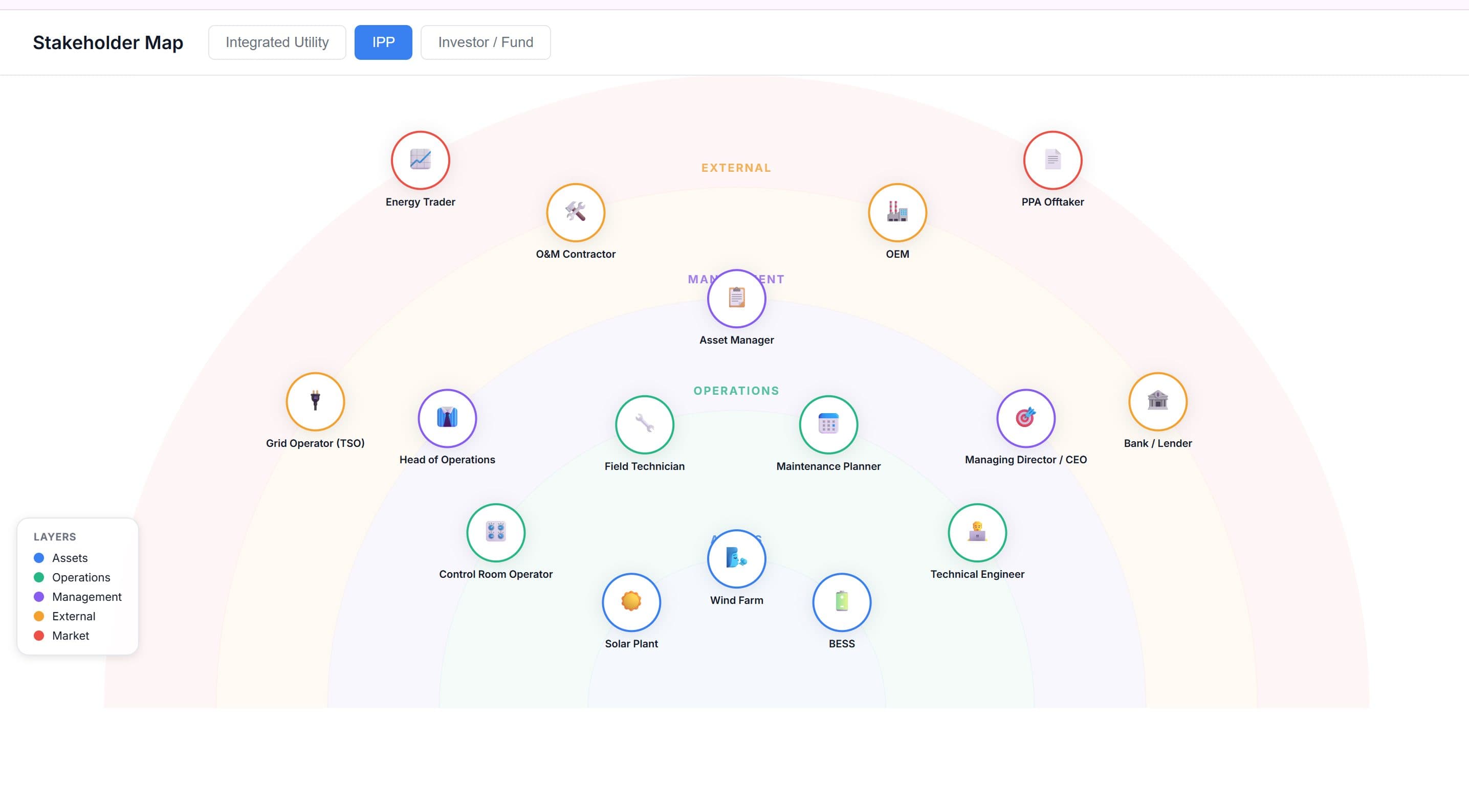
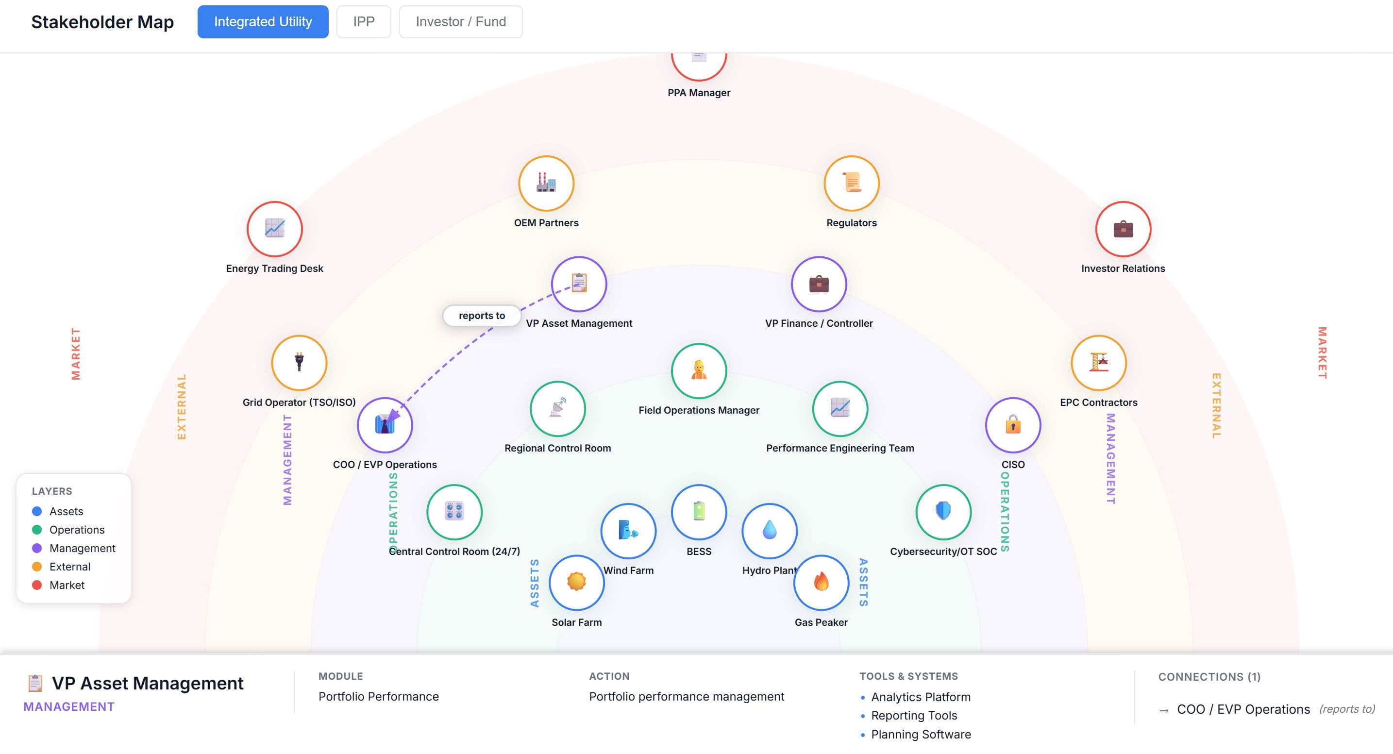
Built an interactive map showing each company type side by side: who is involved, what tools they use, and where the tensions are.
The map
Switch between the three company profiles to see how different the actor landscapes are.
Key findings
Size and structure change who holds the tools
A large power company runs a 24/7 central control room with cybersecurity specialists, regional dashboards and full software integration. A mid-size independent producer often has one technical engineer covering the work of three roles, and the handoffs are organised differently too.
The same tool sits in different hands
Performance dashboards, maintenance scheduling and forecasting appear across all three company types, but who owns them, who reads them and who acts on them varies completely. A feature that serves an asset manager in a large utility may need to serve a director directly in a fund.
Tensions are structural, not accidental
Equipment manufacturers often overstate availability figures, a known tension in the sector. Field technicians work offline while control rooms depend on real-time data. Both are built into how the sector operates.
Outcomes
- ✓Interactive map comparing three company types, with people layers, tool annotations and tension flags
- ✓87 stakeholders mapped across all profiles, each with role, tools and data source
- ✓Used by the client to decide which roles and relationships the product should support first
Reflection
Mapping by role first, instead of by system, is what surfaced the tensions above. The data-flow diagrams in vendor materials hid the people doing the work. If I continue, I want the map to also show what breaks between the company types.