Product Design · UX Research · Data Tables
Pricing a project on one dense table
Rodeo is bought to price project work correctly. Estimating and tracking both live on the budget page, which is what makes it dense, and the table had stopped being readable.
- Year
- 2019 to 2020
- Role
- UX Designer and Researcher
- Context
- Rodeo, project management software, Amsterdam
- Surfaces
- Budget page, data table, project settings
- Methods
- Heuristic evaluation, eight competitors, customer complaints, five prototype tests
- Status
- Shipped
Estimating and tracking sit on the same screen
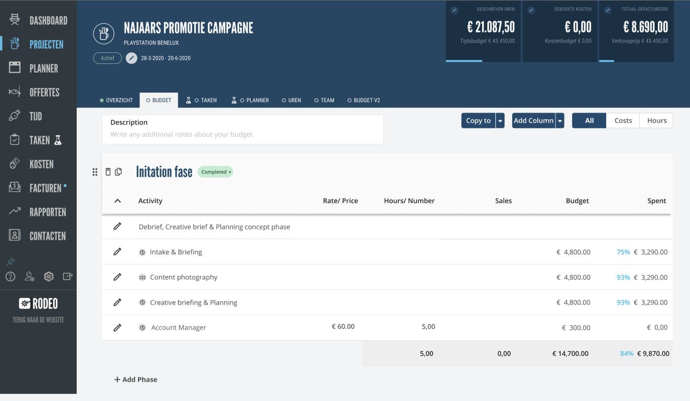
A project manager splits a project into phases or books activities separately, sets hours, an hourly rate and expenses on each activity, then watches deadlines and what is left of the budget while the work runs. Quoting the job and checking the job are the same table, read at two different moments.
That is what makes the page hard. Every row has to carry a number someone will defend to a client, and the whole table has to stay scannable while it grows.
Four sources, so the problem list was not my opinion
- 1
Heuristic evaluation
Walked the budget flow against usability heuristics and wrote down every place the interface broke one, so the problems had a stated basis rather than a preference behind them. The same evaluation covered the project setup screen, where what came out of it reduced setup time by 30%.
- 2
Comparative analysis, eight competitors
Compared how other project management tools structure estimating, rates and expenses. Where the category had already settled a pattern, there was no reason to reinvent it here.
- 3
Customer complaints
Read what users had already reported, so the work started from problems people had bothered to write in about rather than from what was easiest to see.
- 4
Prototype tests, five participants
Tested the redesign on a prototype before it was built.
The table was the problem, not the feature set
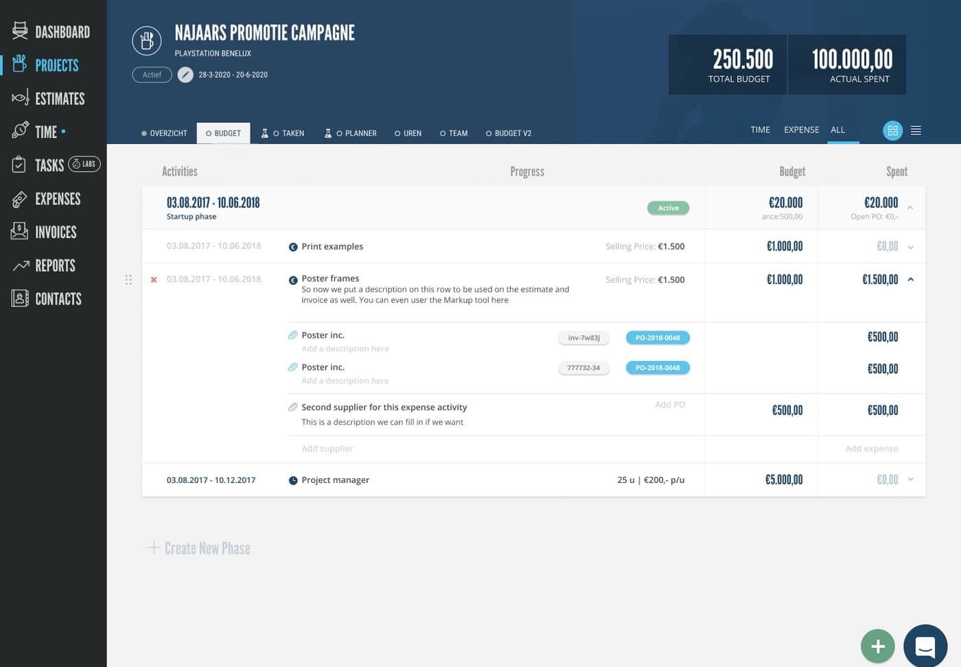
Nothing was missing from the page. What was missing was hierarchy: four separate things made a table of numbers harder to read than the numbers themselves warranted.
Navigation and sorting looked the same
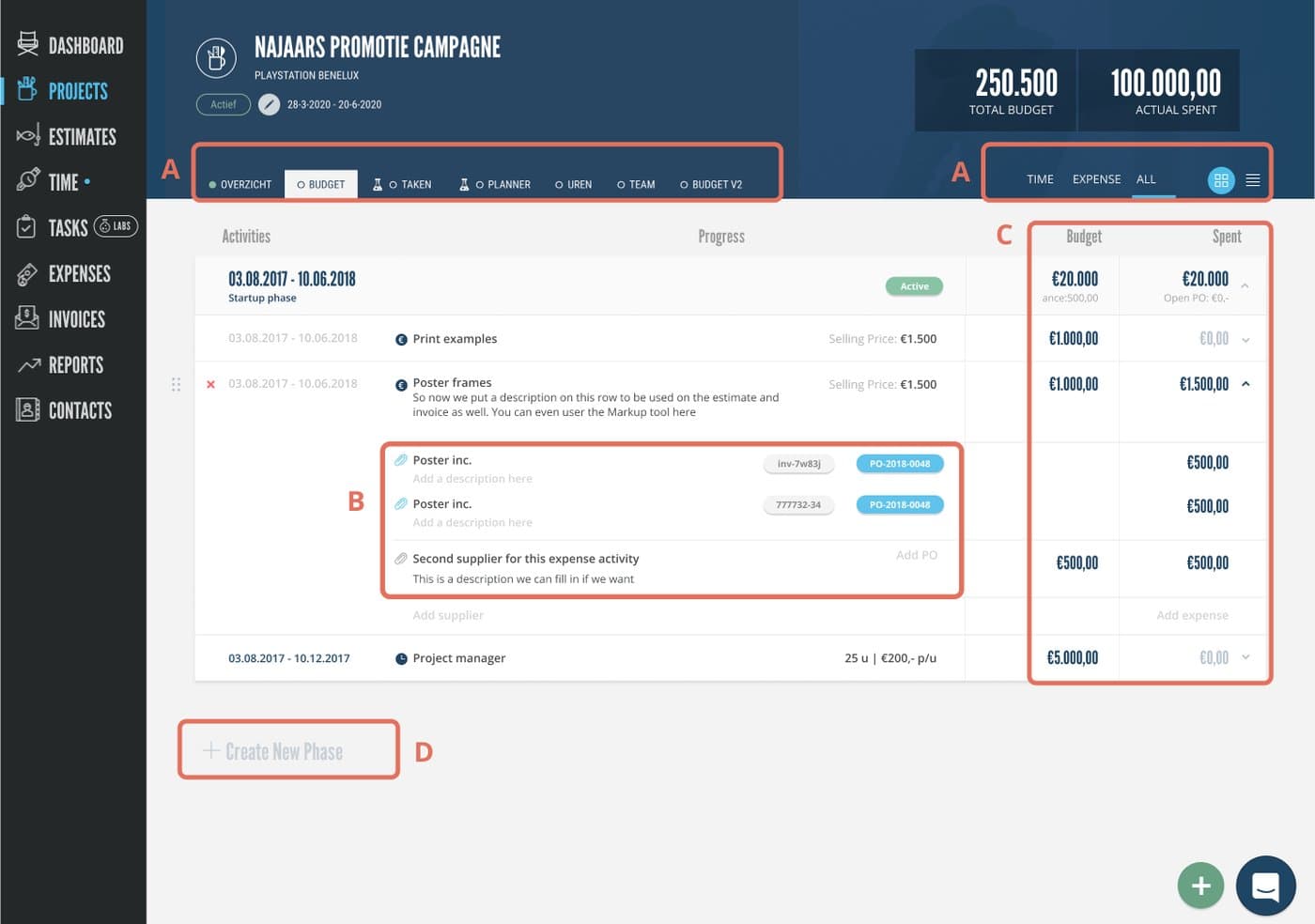
Nav tabs and sorting tabs sat on the same level with near identical styling, so two different kinds of control read as one row. Nothing told a user which one changed the page and which one changed the order.
Parent rows and child rows were indistinguishable
Expandable rows used the same border and background as the rows inside them. Once a row was open, the hierarchy the table depends on disappeared exactly when it was needed most.
The figures were set in a display face
League Gothic is a condensed display face. On a page whose whole purpose is reading and comparing amounts, it made scanning a column of numbers harder than it needed to be.
Gray on gray read as disabled
Gray text on a gray background is the convention for a control you cannot use. Applied to live content, it made working elements look switched off.
Expandable rows became a side drawer
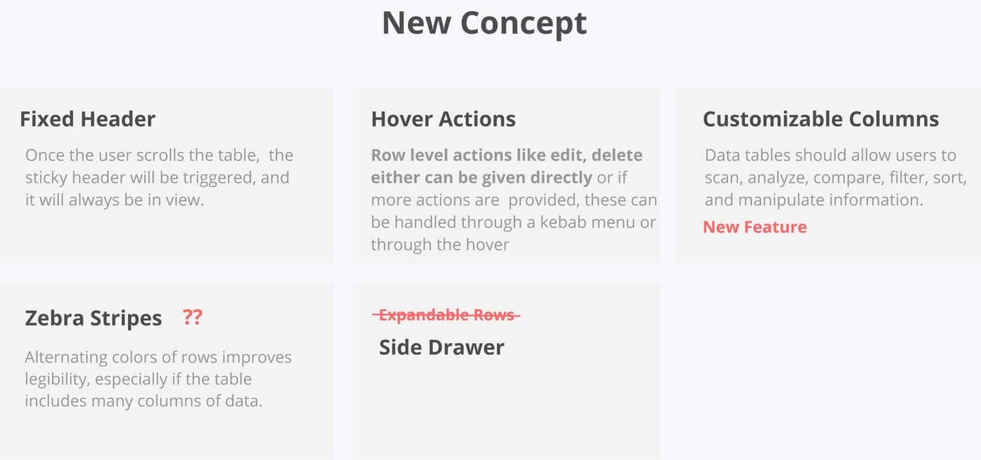
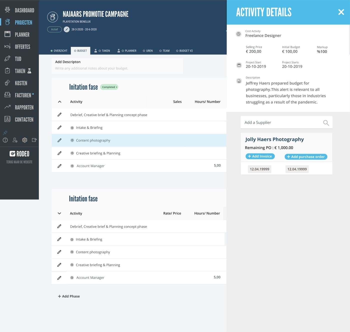
The concept round put the usual data table patterns on the table and decided between them rather than collecting all of them. A fixed header, row level hover actions and customisable columns went in. Zebra stripes stayed an open question. Expandable rows were dropped, because they were the source of the hierarchy problem, and detail moved into a side drawer instead.
Editing happens where the number is
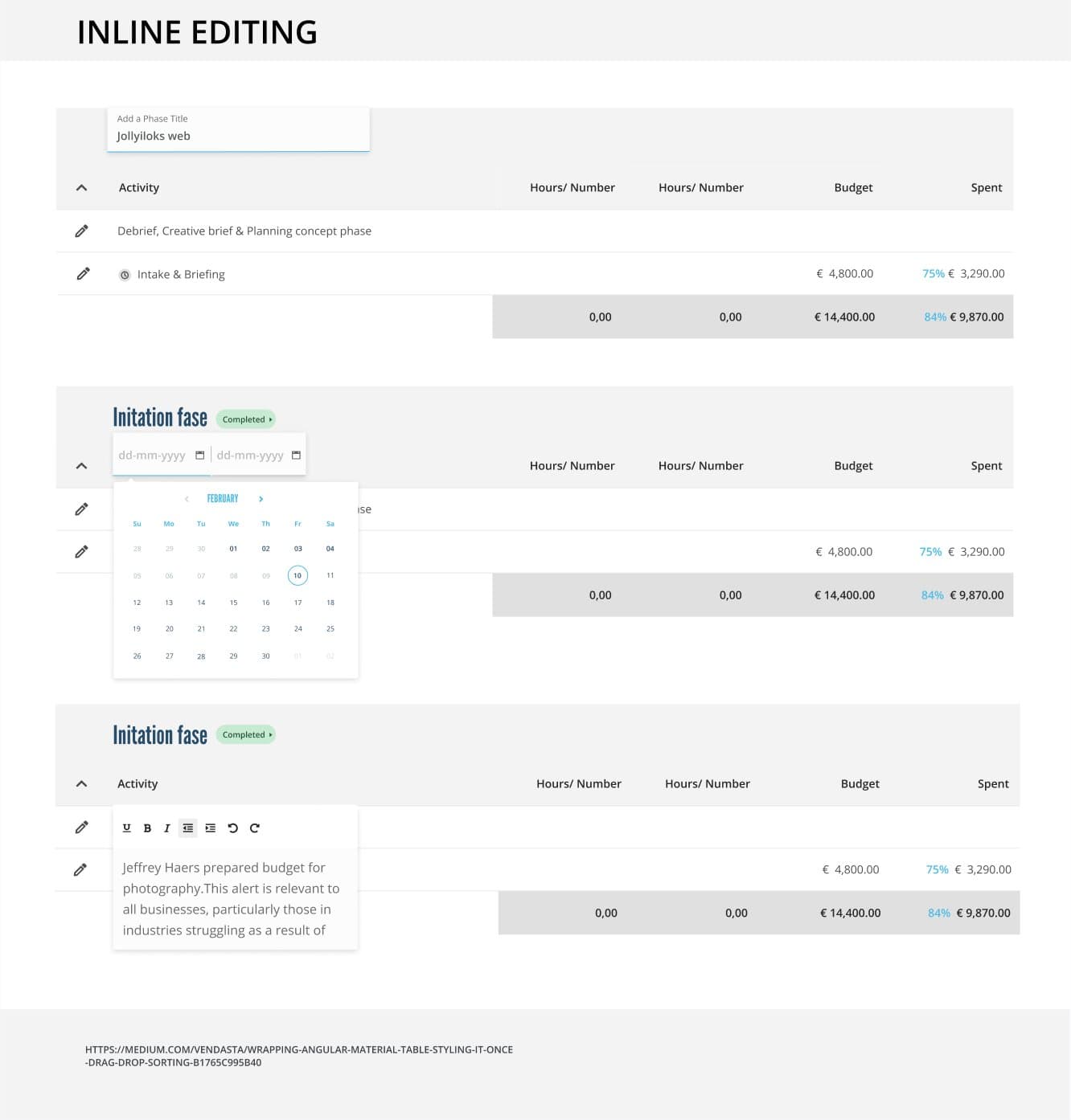
A budget is corrected constantly, so the redesign keeps editing in the row: the phase title, the date range and the description are all edited in place rather than in a separate form. The totals row underneath keeps the figure a manager is actually watching in view while they change the rows above it.
New components inside the existing language
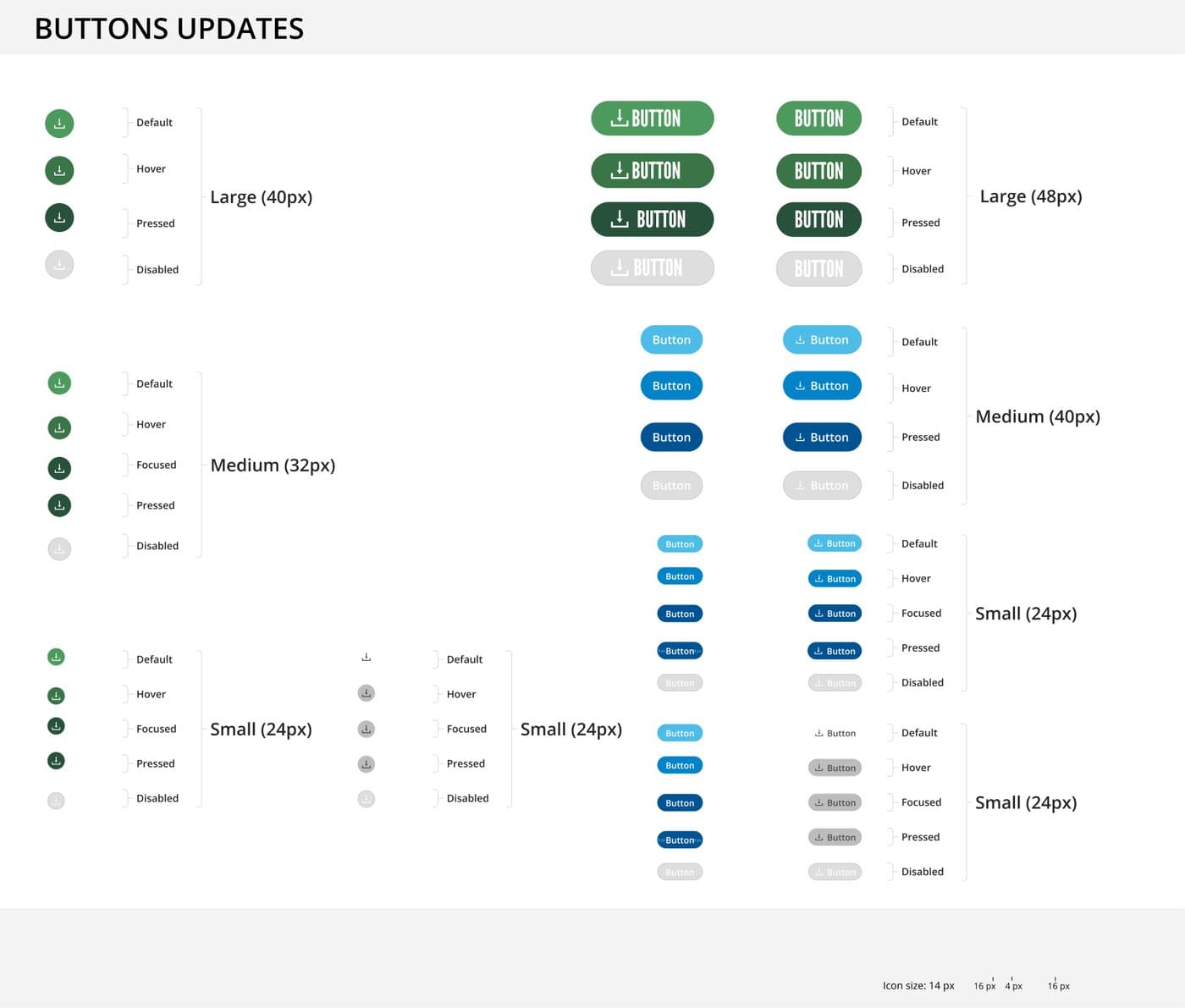
The new feature needed components the interface did not have yet. I designed them inside the existing design language rather than beside it, with every size and state specified, so the new parts of the page did not announce themselves as new. On a screen this dense, consistency is what keeps it readable.
Outcomes
- ✓Budget page restructured around the three things it has to answer: what an activity costs, what the project costs, and what is left
- ✓Table hierarchy made legible: navigation separated from sorting, detail moved out of expandable rows into a side drawer, figures set in a face built for numbers
- ✓Inline editing for phase titles, dates and descriptions, so a budget is corrected where it is read
- ✓New components delivered inside the existing design language, sizes and states specified